When I set out to make my own seasonal wall art, I had one rule: it couldn’t look like a typical printable. I wanted something that felt like real art, but that most people would still love to hang in their home.
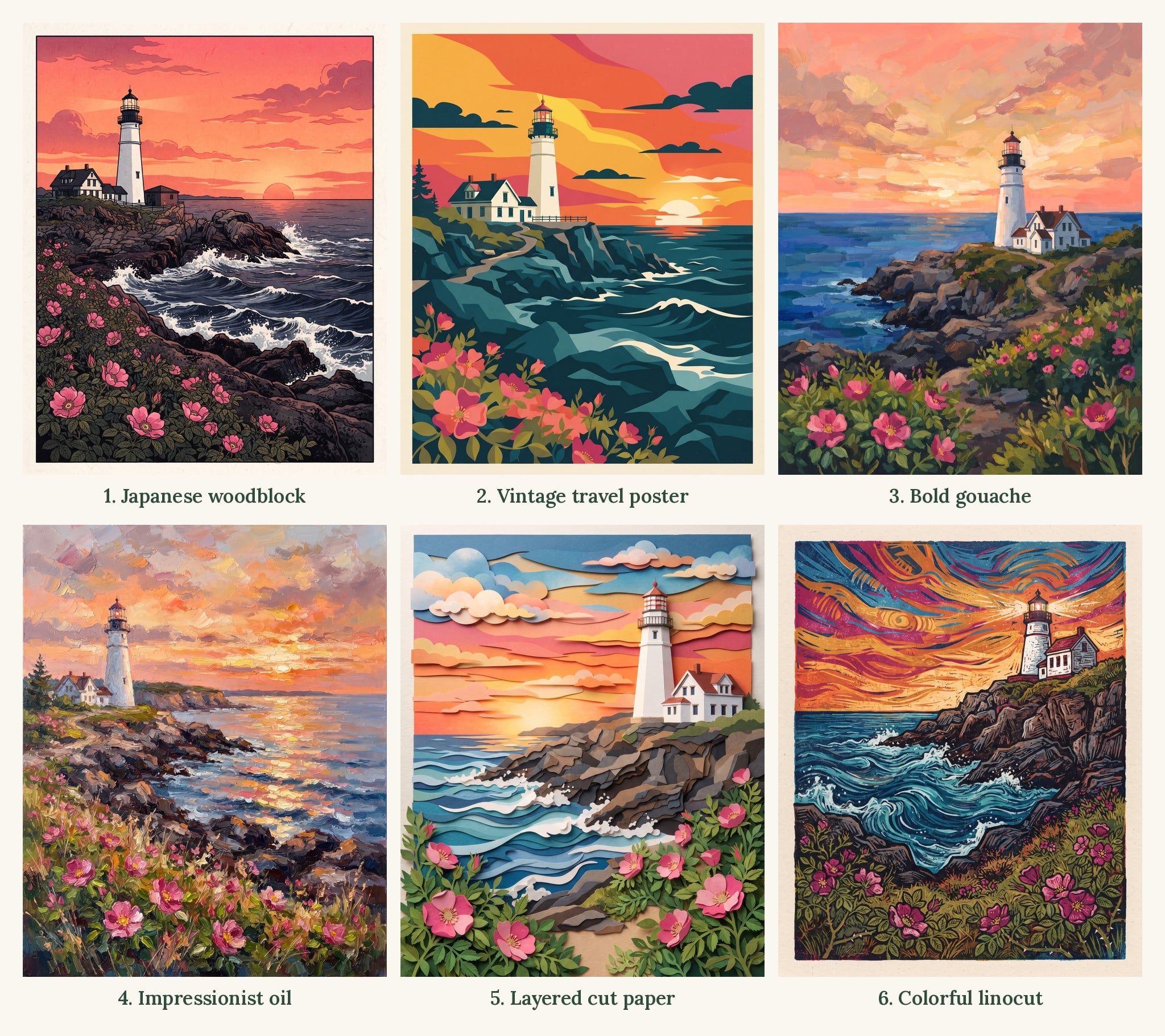
The problem is that “real art” can mean a hundred different things. So instead of guessing, I ran a test. I gave Gemini the exact same scene, a white lighthouse on a rocky New England coast at sunset with pink beach roses in the front, and changed only the art style.
Six styles, one scene. Here’s what each one looked like, the exact prompt I used, and the one I ended up choosing for all 12 of my prints.
Want to try this yourself? Copy any prompt below into Gemini, then swap the lighthouse for your own scene. If you’re brand new to this, start with my step-by-step guide to making printable wall art with Gemini.
FREE FOR READERS
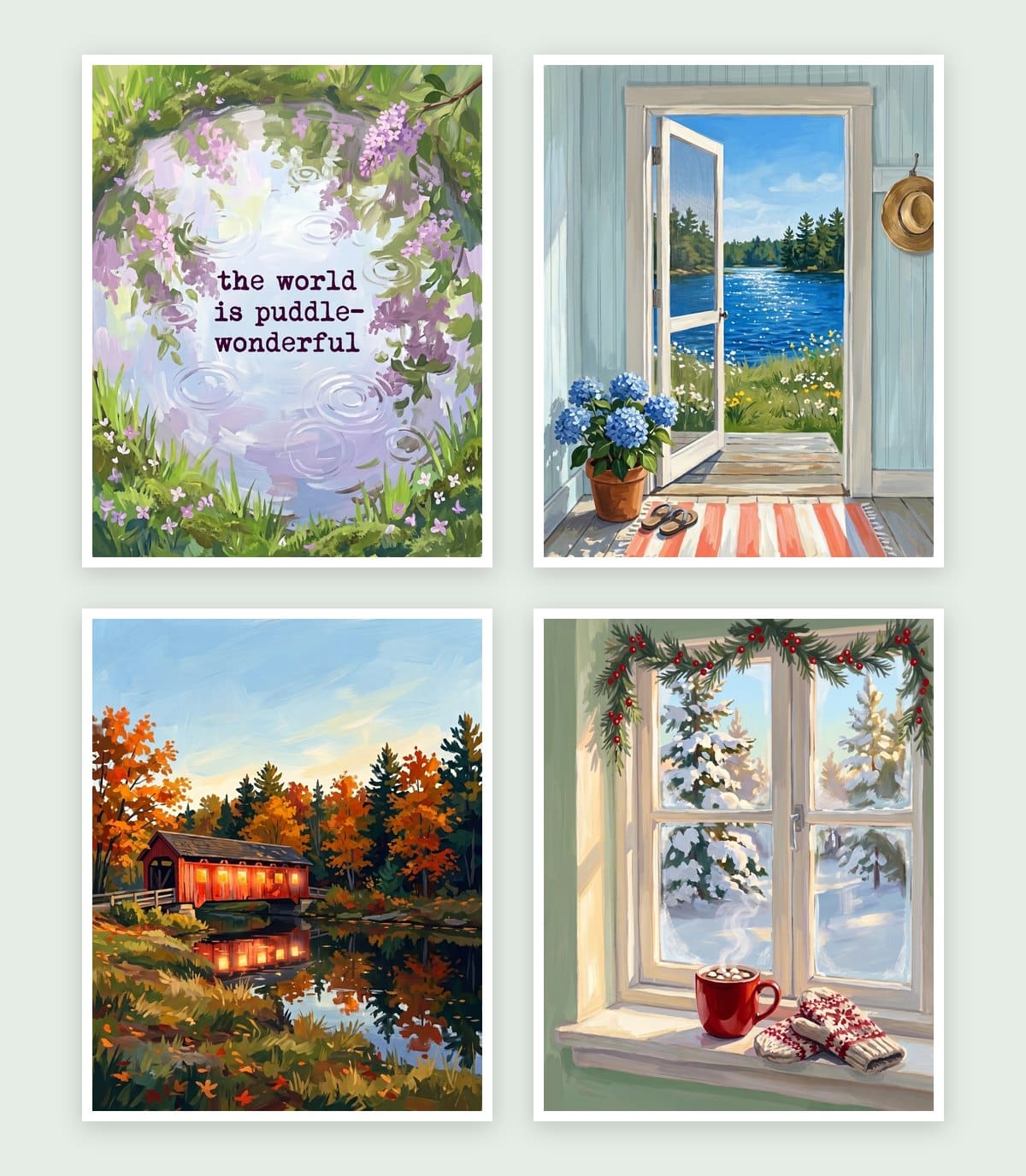
Seasonal Decorating, Made Simple
12 painted prints, three for every season. Just print, frame and swap.
1. Japanese woodblock print
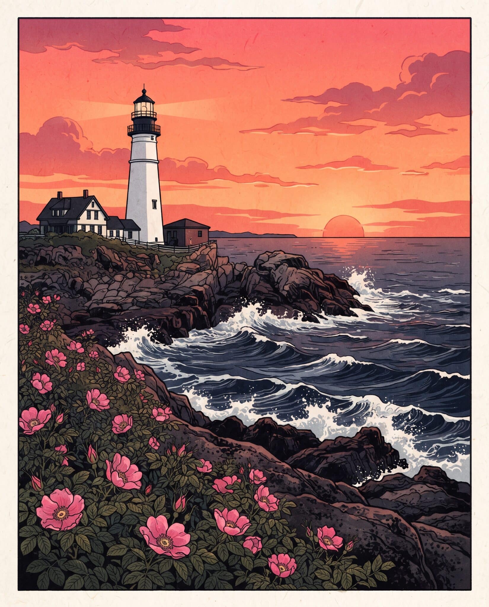
This was actually my first plan. I made a few New England scenes in a soft, muted woodblock style, and up close they were lovely. But when I pictured one in a small signup box on my site, it just didn’t pop. Everything blended together.
So I tried it again with bold, saturated color:
printable wall art, Japanese woodblock print style, shin-hanga, white lighthouse on a rocky New England coast at sunset, wild pink beach roses in the foreground, rich saturated colors, deep indigo sea, glowing orange and coral sky, bold vermilion accents, strong contrast, crisp black outlines, flat layered color, dramatic and beautiful, simple and uncluttered, perfect composition, no text no words, no Japanese characters, no seal stamps, no signature, flat artwork only, not a mockup, no frame, no white border, fills the entire image edge to edge, 4:5 aspect ratio
My verdict: out. Even with brighter color, it wasn’t the look I wanted.
Tip if you love this style: add “no Japanese characters, no seal stamps.” Gemini likes to add fake stamps and lettering in the corner.
2. Vintage travel poster
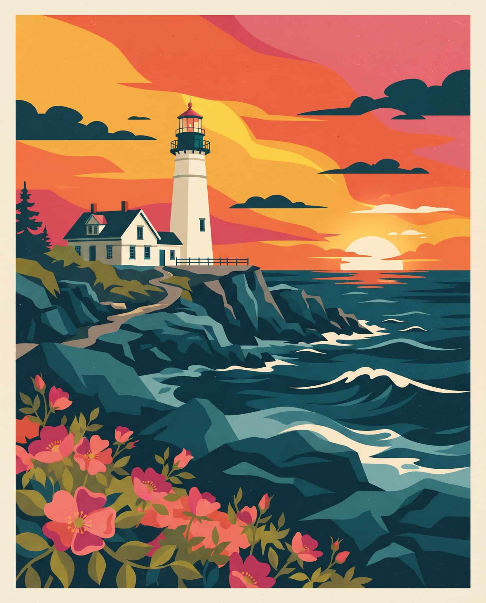
printable wall art, vintage 1930s travel poster illustration style, white lighthouse on a rocky New England coast at sunset, wild pink beach roses in the foreground, bold flat color shapes, rich saturated palette of deep teal, golden orange, coral and cream, strong graphic silhouettes, dramatic sky, subtle screen print texture, simple and uncluttered, perfect composition, no text no words, no title, no lettering, no signature, flat artwork only, not a mockup, no frame, no white border, fills the entire image edge to edge, 4:5 aspect ratio
My verdict: good, and bold enough to stand out. But it leans on a set color palette, and I didn’t want every season locked into the same colors.
3. Bold painterly gouache
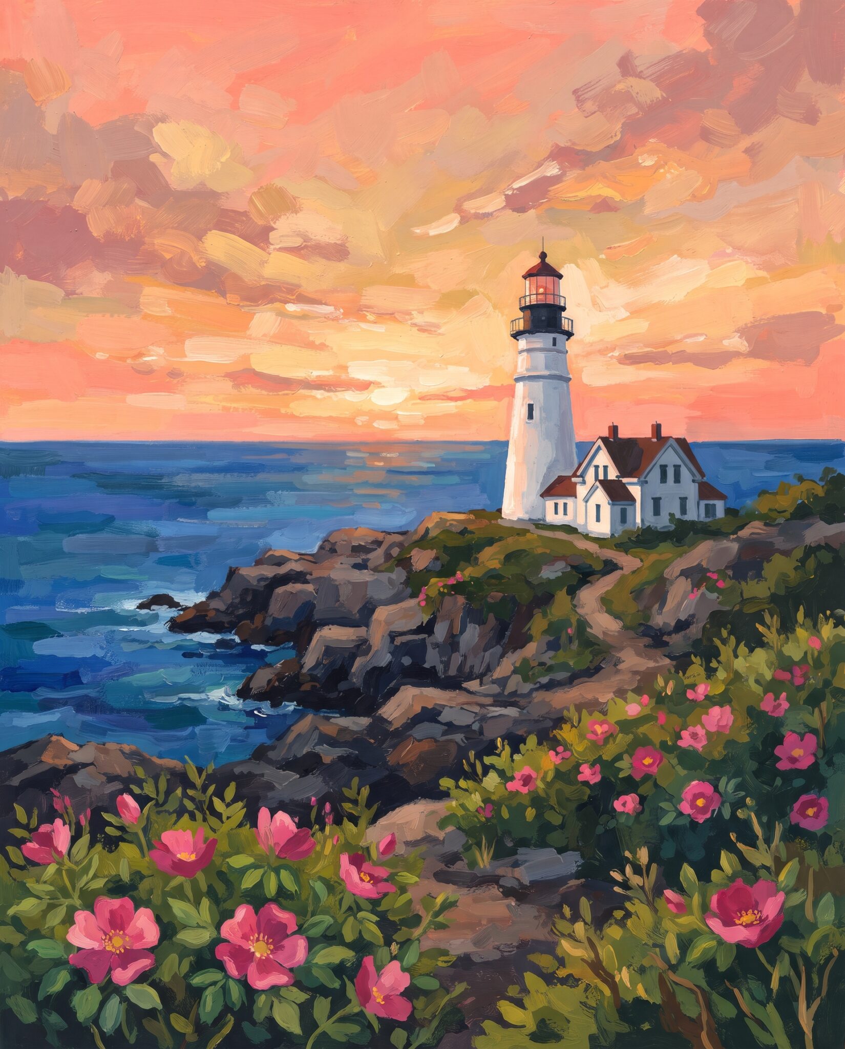
printable wall art, bold painterly gouache style, opaque, matte, white lighthouse on a rocky New England coast at golden hour, wild pink beach roses in the foreground, rich jewel-tone colors, deep blue sea, glowing sunset sky in coral and gold, visible brushstrokes, vibrant and luminous, gallery art feel, simple and uncluttered, perfect composition, no text no words, no signature, flat artwork only, not a mockup, no frame, no white border, fills the entire image edge to edge, 4:5 aspect ratio
My verdict: this one surprised me. I didn’t expect to like gouache this much, but it was so pretty. It looked like a real painting and still felt bright and happy.
4. Impressionist oil painting
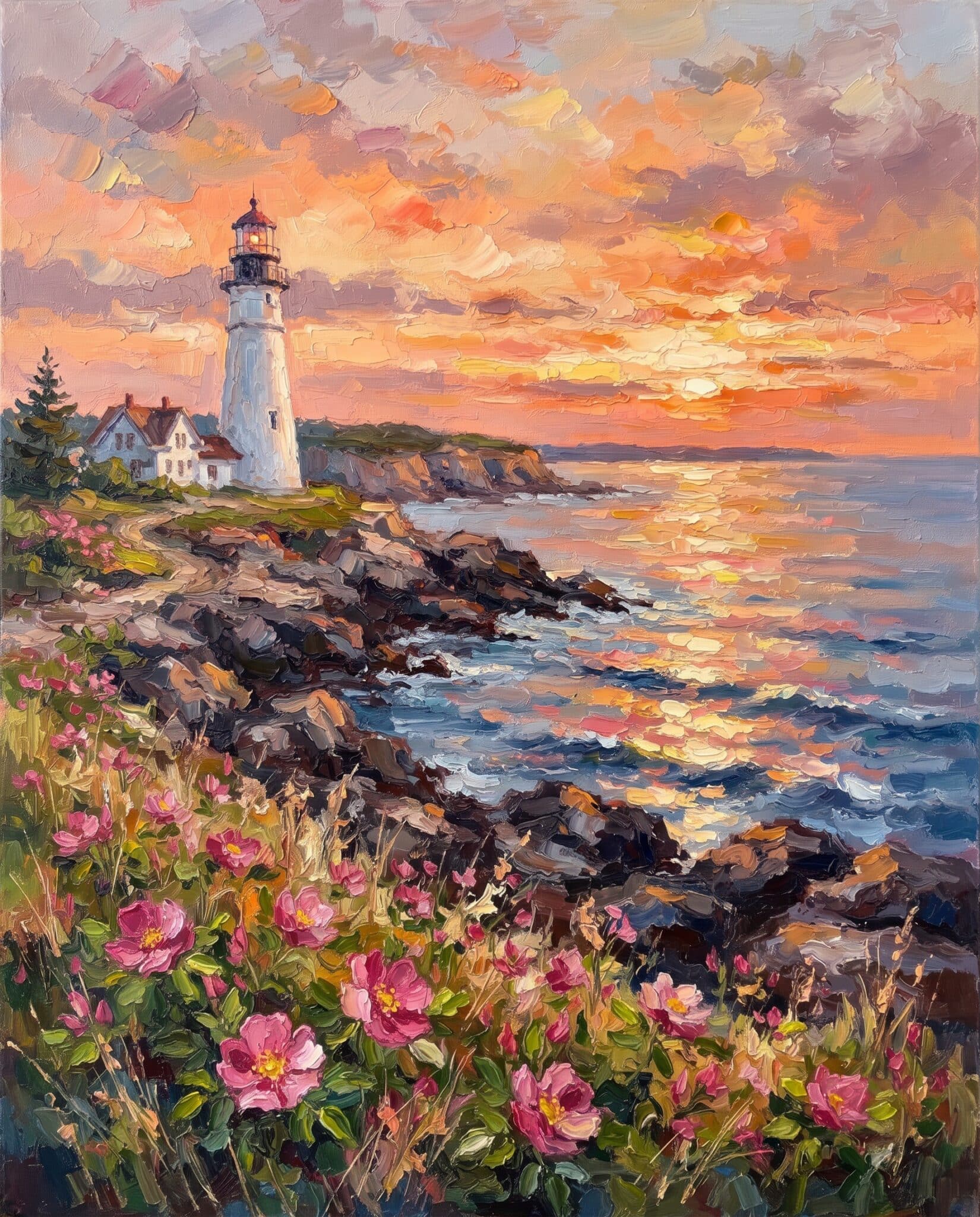
printable wall art, impressionist oil painting style, thick textured brushstrokes, white lighthouse on a rocky New England coast at sunset, wild pink beach roses in the foreground, shimmering light on the water, vibrant and luminous, plein air painting feel, gallery art, simple and uncluttered, perfect composition, no text no words, no signature, flat artwork only, not a mockup, no frame, no white border, fills the entire image edge to edge, 4:5 aspect ratio
My verdict: this was not the one for me. It didn’t read fresh to me.
5. Layered cut paper
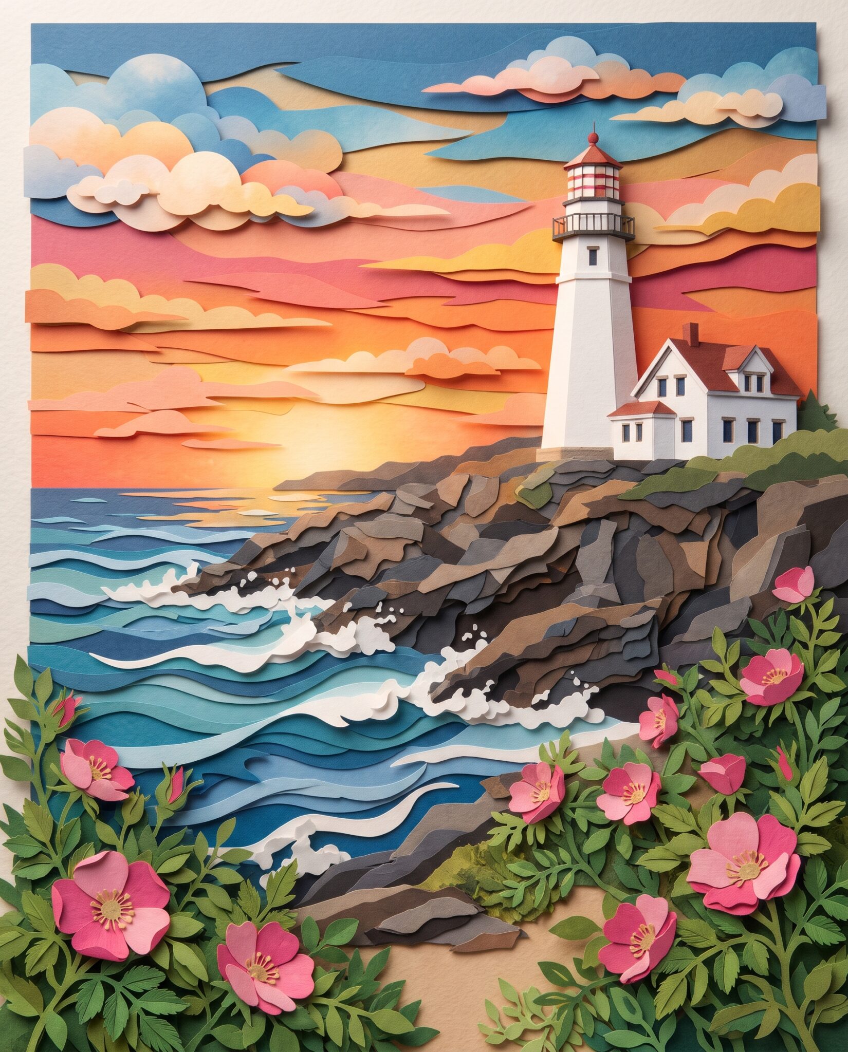
printable wall art, layered cut paper art style, papercraft collage with soft shadows between layers, white lighthouse on a rocky New England coast at sunset, wild pink beach roses in the foreground, layered waves and clouds, vibrant colors, handmade dimensional feel, simple and uncluttered, perfect composition, no text no words, no signature, flat artwork only, not a mockup, no frame, no white border, fills the entire image edge to edge, 4:5 aspect ratio
My verdict: I love the paper cut style and I would definitely use this for something, but for what I needed, it wasn’t quite right.
6. Colorful linocut print
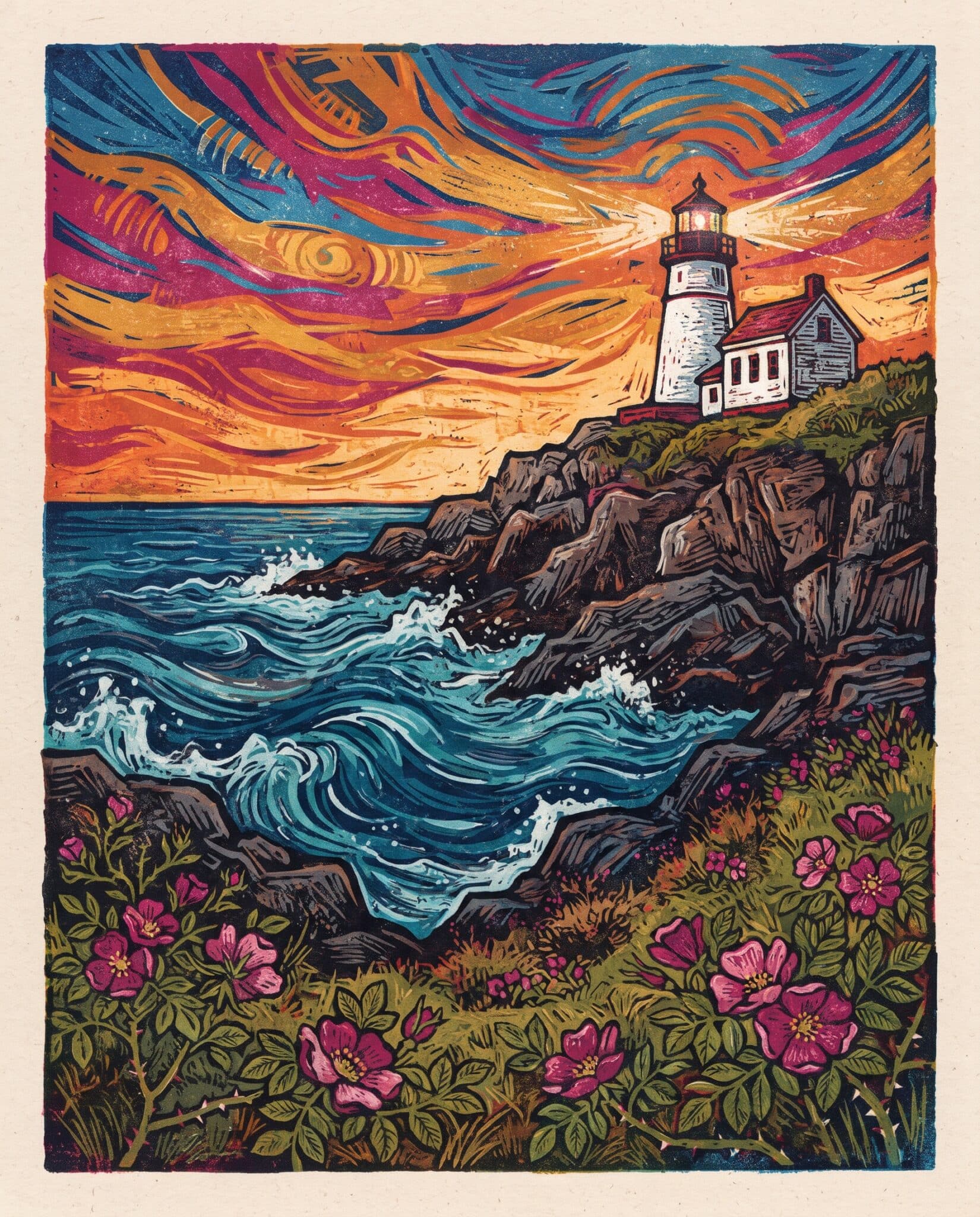
printable wall art, colorful linocut block print style, bold carved lines, visible ink texture, white lighthouse on a rocky New England coast at sunset, wild pink beach roses in the foreground, swirling sky and waves, vibrant colors, handmade printmaking feel, simple and uncluttered, perfect composition, no text no words, no signature, flat artwork only, not a mockup, no frame, no white border, fills the entire image edge to edge, 4:5 aspect ratio
My verdict: There is something cool about this, but not for this subject. I would see it used as illustration in a book.
Why I chose gouache
After all six, I kept coming back to gouache. Here’s why it won:
- It looks like a real painting. You can see the brushstrokes, so it reads as art, not clip art.
- It’s bright without being loud. It stands out on a wall and in a small photo, which the muted woodblock never did.
- It works for every season. I dropped the color words from my prompts and let each scene bring its own colors: pink blossoms in spring, golden light in summer, glowing maples in fall, snowy blue in winter. The brushwork ties the set together.
- Most people would hang it. It’s artistic, but not so unusual that it only fits one kind of home.
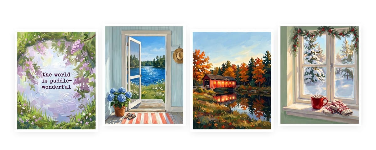
One funny twist: the gouache lighthouse that won the style test didn’t make my final set. Next to the other prints, its dark rocks and dramatic sunset felt heavier than everything else. I swapped it for a summer lake scene with a red canoe.
What I learned from testing styles
- Test with one scene. Changing only the style is the fastest way to see what you actually like.
- Picture it small. Look at your test images at thumbnail size. If it doesn’t stand out small, it won’t stand out across a room either.
- Be careful with color words. A style that depends on one color palette can make every season look the same.
- Save your winner as a reference. Once you pick a style, upload your favorite image with each new prompt so the whole set matches.
Watch the edges. Three of my six lighthouses (the woodblock, the travel poster and the linocut) came back with a cream border or a printed edge, even though every prompt said “no white border.” Gemini doesn’t always listen. Here’s how to get rid of borders, plus other common fixes, in my guide to fixing common Gemini image problems.
Get the free prints
See the finished gouache set in my free Seasons Collection: 12 prints, three for every season, sized at 8×10 and ready to print. Sign up below and I’ll send them to your inbox, along with my free Everyday Printables Playbook, which has 18 art styles to try.