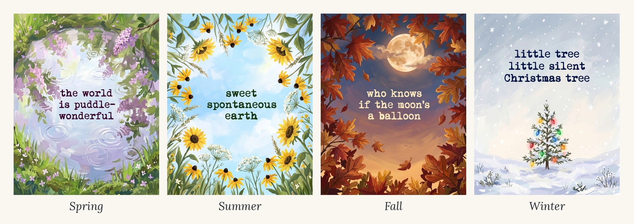
When I planned my Seasons Collection, I wanted more than pretty scenes. I wanted one print in each season with a few words on it, something that would make you smile every time you walked past.
I adore E. E. Cummings, so I used short lines from his early poems: “the world is puddle-wonderful,” “sweet spontaneous earth,” “who knows if the moon’s a balloon” and “little tree little silent Christmas tree.”
Getting words onto AI art turned out to be the trickiest part of the whole set. Here’s what worked, what didn’t, and the easy backup plan when Gemini just won’t spell it right.
Step 1: Choose your words
The right words do half the work. A few things I learned:
FREE FOR READERS
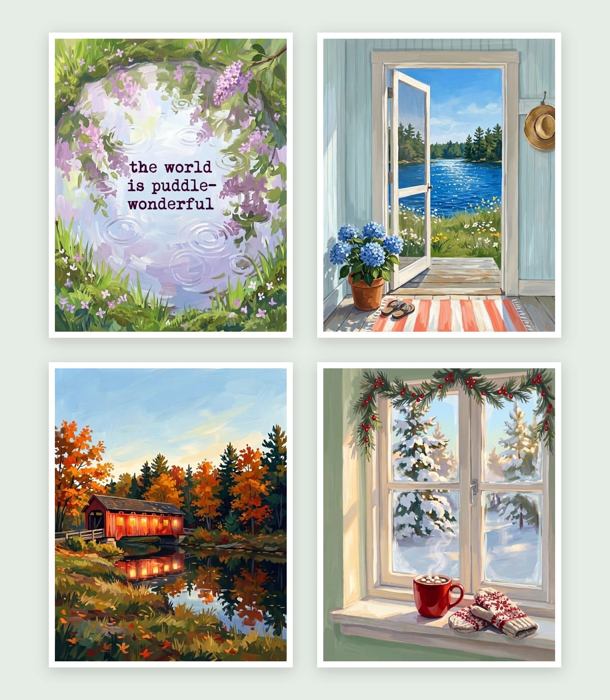
Seasonal Decorating, Made Simple
12 painted prints, three for every season. Just print, frame and swap.
- Keep it short. Five to eight words is plenty. Gemini gets spelling right more often with fewer words, and short lines are easier to read from across a room.
- Plan for three lines. Breaking a phrase into three short lines looks more like art and less like a sign.
- Match the words to the art. “the world is puddle-wonderful” belongs with a rainy spring puddle, not a sunny beach.
- Use words you’re allowed to use. Song lyrics and most modern poems are copyrighted, especially if you share or sell your prints. Older poems in the public domain are safe. The Cummings poems I chose were first published in the 1920s and are in the public domain in the United States.
Tip: search for poems published before 1929. Those are in the public domain in the United States.
Option 1: Let Gemini add the words
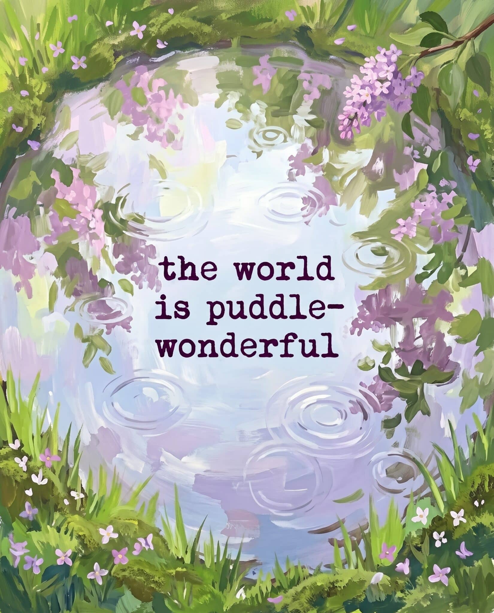
Gemini can put words on your art, but you have to be very specific. Tell it the exact words in quotes, the font style, how many lines, the size and where they go.
Here’s a prompt template to start from:
printable wall art, bold painterly gouache style, [your scene], leave open space in the [sky / top third] for text, add the words "the world / is puddle- / wonderful" on three lines in a small vintage typewriter font, dark ink color, lowercase, spelled exactly as written, no other text, no signature, flat artwork only, not a mockup, no frame, no white border, fills the entire image edge to edge, 4:5 aspect ratio
Tips that made the difference:
- Put the words in quotes and add “spelled exactly as written.”
- Ask for open space. Leaving room in the sky or a calm area keeps the words from fighting the art.
- Ask for small text. Gemini makes words big. My puddle print got so close, and the fix was simply asking it to make the font smaller.
- Say “no other text.” Otherwise Gemini may add extra words or a fake signature.
- Check every letter. Zoom in before you print. One wrong letter is easy to miss on a phone screen.
Option 2: Add the words in Canva
If Gemini keeps misspelling your words or putting them in the wrong spot, make the art with no text and add the words yourself. This was always my backup plan, and it gives you full control.
- Make the art without words. Use your normal prompt, but add “leave open space in the sky for text” so there’s room.
- Upscale it first so the art prints sharp. Here’s how I upscale for free.
- Create an 8 x 10 inch design in Canva and drop the image in so it fills the page.
- Add a text box and type your words on three short lines.
- Pick a typewriter font. Search Canva’s fonts for “typewriter” and try a few.
- Keep it small and dark. Use a deep color pulled from the art, like a dark green or navy, instead of plain black.
- Download as PDF Print for the sharpest result.

I was able to do all of my word art right in Gemini, so there was no need for switching apps, but it’s good to have a back up plan if you need it.
What I learned about fonts and layout
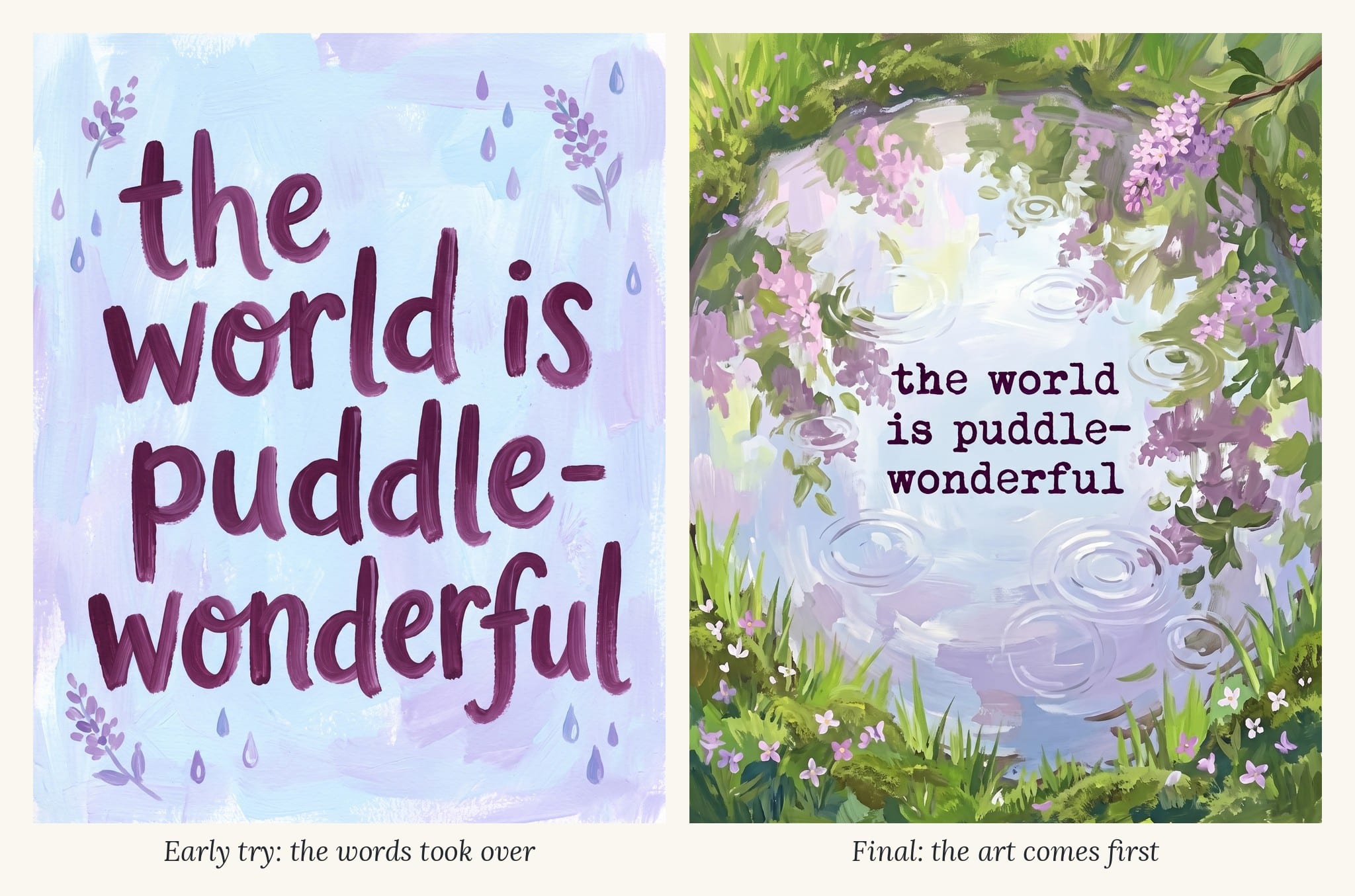
My first word art tries didn’t look right, and it took a few rounds to figure out why.
- Too playful didn’t work. Bubbly, cutesy fonts made the print look like a greeting card, not art. A simple typewriter font felt timeless and let the painting shine.
- Too little background didn’t work either. When the words took over and the art was just a plain backdrop, it stopped feeling like a painting. The art should come first and the words second.
- The art should show the words. For “puddle-wonderful,” I wanted a real puddle in the scene, so I asked for one. When the picture matches the words, the whole print clicks.
- Lowercase suits poetry. Cummings wrote in lowercase, and keeping it that way made the prints feel softer and more personal.
- Smaller is better. Every time I made the words smaller, the print looked more expensive.
Get the prints
See all four word art prints, plus eight more seasonal scenes, in my free Seasons Collection: 12 gouache prints, sized at 8×10 and ready to print. Sign up below and I’ll send them to your inbox, along with my free Everyday Printables Playbook so you can make your own.